Sunday, November 9, 2008

Graphics Project


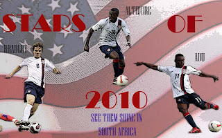
This is the poster I designed for the graphics project. It is a poster of future stars of American soccer and refers to the World Cup 2010 in South Africa. It is a teaser poster of sorts because it doesn’t explicitly mention the World Cup, but it gives enough information to look it up on the web. I started out with the basic idea of a soccer and gradually refined what the poster was about. The biggest step in figuring out what I wanted was the background. When I found a large file on an American flag, that made it easy to decide. I used a couple of effects on it. First, I made it opaque so the players and the lettering would stand out. I also used a filtering effect (movie poster) because it made the light and dark of the picture stand out more. I used the same effect for pictures of the players because it made the harsh lighting of the stadium more nuanced as well as made the lines stand out. One trouble I hit with the background was the white of Bradley’s socks blended in with the white of the flag. To fix this, I used a very light grey gradient going from bottom left to top right to make his leg stand out. The balance between light and dark is effective because it provides some good contrast in the different images.

In general, I was going for a movie or show poster feel since soccer and other sports are forms of entertainment whose appeal are also frequently driven by star power. The font of “Stars of 2010” is appropriately named Broadway. The backdrop of actual stars for the word “Stars” and the word “shine” make the point that these players will (hopefully) be something special to see. I also put the players in a triangle shape, for a few reasons. Triangles are much more visually powerful than players in a horizontal line. Their positions also approximate their positions on the field as viewed from behind the goal since Altidore is a striker and the other two midfielders. Triangles are also important to passing in soccer, as players try to form triangles to move the ball around the field. The poster also relies heavily on the (presumed) patriotism of the viewer. The players are all in their National team uniform and only the player’s names and the opposing player’s leg disrupt the color scheme. The purpose of this is to get people (or at least US soccer fans) excited for the next World Cup.

Friday, November 7, 2008

Youtube Assignment

http://www.youtube.com/watch?v=CnHLMA1qS-c


The video I picked for this assignment is called Chosen. It is a short film/commercial directed by Ang Lee and stars Clive Owen. This film is a commercial for BMW (and was originally released on their website) but it can be rightfully called a short film, clocking in at a little over 8 minutes and never shown on television. The story follows Clive Owen as the driver. He picks up a young Asian boy, presumably someone holy/important, that was brought to a dock via boat. The boy gives him a gift, which is “for later”. Once he starts driving away, he is beset upon by various bad guys in cars. He generally outmaneuvers them, while also showing his cars traction on snow and power sufficient to push another car away. They get away and he delivers the boy to a safe house. The boy looks uncertain though and Clive notices the monk greeting them wearing boots. Clive sneaks around a little, sees the real monks tied up, and goes to save the boy which he does. He then exits the house and opens the gift. It turns out to be a Band-Aid and he realizes that his ear is bleeding from a small injury received earlier Lee uses many different shots in the film. Most shots are close-ups, like in the car scenes or medium shots, used when there a lull in the action. Some shots that were particularly interesting were point of view shots. He uses shots from under the bumper, making the viewer the car, effectively. He also uses POV when Owen sees the boots on the monk. That was a very effective way of showing that something is wrong and Owen knows it. That same sort of shot is repeated near the end. Owen knocks out the imposter monk and we get a shot of his boots. We then get a POV shot from Owen’s position of the young boy smiling at him. The symmetry of the shots is very effective. Besides that, many shots are generally typical, at least in the action scenes. You get a high-angle tracking shot and some behind the driver’s shoulder shots, both of which stand out. The second is effective since it makes the viewer feel like the driver. It is too bad it is probably impossible to get a good quality shot from the driver’s position, so Lee had to go for the next best thing.

Overall, this is a very effective piece. Lee’s more “artsy” style comes out, which is effective in separating this from just another short film or commercial. Lee is also very skilled at creating relationships and this is seen here with the relationship between Owen and the boy. They only speak to each other once but their thoughts toward each other are shown well through camera work and the skilled actors. There is nothing I would change about it. One shot that Lee choose near the beginning (the boat rubbing up against the dock) is slightly jarring for the viewer so it might not have been what I done, but it is a pretty shot, so no real complaints there.

Monday, October 27, 2008

Photo Idea Index Homework

The picture discussed in this assignment came from The Economist issue dated August 30th-September 5th 2008. The picture was on page 33 and went with an article titled “The trailers that smelt bad.” The article talks about people displaced by Hurricane Katrina living in trailers provided by the government that had high levels of formaldehyde, leading to health problems for many residents. It is a particularly sad situation because FEMA, who ordered the trailers, knew of the high levels of formaldehyde but ignored it. There is currently a class-action lawsuit against FEMA as well as against the manufacturer’s of the trailers. 15,000 of the trailers are still in use currently.

The picture that accompanies this article reflects the sad situation. The photo is of two black women, a mother and a daughter, in a trailer. They are both sitting on a small couch, with the mother holding the daughter. The backdrop is fairly busy. The counter behind the two is full of different items, like a red ketchup bottle and a blue cup. The photographer minimizes the influence of the backdrop by keeping the focus on the foreground. This is effective as it allows the viewer to glimpse the mess that these residents are in while still keeping the people as the focal point.

The photography also uses asymmetry to make a statement. The two women are slightly left of center, leaving space in the right third for a blind covering the window. The blind is very disorganized, with the individual pieces going at all different angles compared to the rest of the blind. The blind also goes from being out of focus at the front of the picture to being in focus towards the middle and back. These two effects show the disorganization and the chaos, not only in the lives of the people affected by these blunders, but in the organization before and after Katrina hit New Orleans.

This picture also has a good use of color and lighting. Most of the inside of the trailer consists of darker colors which give it almost a sense of foreboding. The people, and some of their possessions, are what give the picture its color and attract your eyes to them. The lighting is also very important in the message of the picture. The blinds are partially open on what appears to be a bright day. It gives the impression that light is just now being shed on what was once a mysterious or neglected subject.

Saturday, October 4, 2008

Photo Project

HPIM0494
The picture above is the picture I have chosen to talk about. It is one that I took and I feel represents the idea of privacy very well. I took it on a trail through the woods near my apartment and, even though it wasn’t the best day for pictures, it turned out nice. The picture was taken from the side of a hill looking down. It seems to represent privacy for me because the woods are a private place for many people. Many things are hidden there, even just down the trail. As for the photo, I like it primarily because of the trail in it. Beyond telling a story, it provides linear strength to the photo as you follow it beyond the edges. I also made sure to frame it so that the viewer could see the trail winding down from beneath their feet. The rule of thirds is followed to some extent, with the focus on branches on the left. A weaknesses of the photo is that there is no one in it, which adds to the message but gives no perspective of size in the picture.

Images with Messages

Philip Gartland

COM 105

Images with Messages

A Reaction to the Readings

Chapter 12 was generally uncontroversial since it talked mostly about the history of the camera. The Polaroid camera part was interesting but the only thing that stuck out besides that was the sections about privacy. It seems unnatural to me that Florence Thompson could be in this famous portrait that ended up as the face of the Depression and finish up with nothing for it. It just seems disingenuous on the part of the photographer. Likewise, the picture of the naked woman who escaped her abductor seems like a gross invasion of privacy. The newspaper used this exploitative picture to help drive its sales up and I find that disheartening. Those types of pictures may be ok with national tragedies but not with personal tragedies.


Chapter 6 was much more interesting and really shows the bias of the author(s). For one, the author criticizes many different movies where criticisms were simply not necessary. When referencing a movie, it does not matter to the reader whether it is a “forgetful” movie if the author’s focus is on the ad campaign for the movie. Likewise, the author betrays an anti-advertising slant. While many of the arguments are valid, like media’s use of sexist or racist ideas, some of them are unnecessary. Many sentences seem to suggest that advertisers are simply out to “trick” people and ignore the role that advertising plays in informing consumers about the products they buy. Advertising also supports many people and sponsorships often help endeavors that would otherwise not be happening. While it is true that some advertisers overstep their bounds, they also play a valuable role that should not be overlooked. Overall, this chapter just didn’t seem well written or well thought out. It even contained a section header that said “Advertising Controversial Tactics.”

Lonely Planet

Philip Gartland

The Cinema Effect: Realism

“Lonely Planet”, directed by Julian Rosefeldt

The film begins with a singular man crossing the screen. He is clearly a westerner, due to his pale skin, bandana, Che Guevara adorned pack, and Hindu inspired t-shirt. He move through the desert until he meets a few huts and a boat. The viewer is notified that this will not be a normal cinematic experience when the traveler pushing the boat moves the camera as well. The man crosses a river which is intercut with people in a movie theater watching something on screen. He moves through the crowds with the crowds seemingly mocking him. Here, the camera’s perspective is sometimes filming the traveler and sometimes from the traveler’s perspective. He continues down a road walking down the wrong side and then into a train station, which seemingly changes into a call center. We watch the call center for a few minutes until the protagonist suddenly appears from the movie screen and walks into the movie theater. He walks through the crowds and into the streets. He finds himself in a Bollywood style set, where make-up is applied to him. People start singing and dancing all around him as he joins in. He leaves, going through the scaffolding as he walks through a ghost town and into the distance as a camera appears in the shot.


This film is, first and foremost, and unbelievably beautiful film. Much of the film is in wide shot and deep focus, allowing the audience to view all the natural beauty of the scenes outdoors. It also allows the audience to see all of the hustle and bustle of life in the city. There are no close up shots as the closest one comes to that are shots with several people in them. The camera also transitions a lot from eye-level to almost and omniscient shot above all of the action. Most of the street and cinema shots are from eye-level, giving the viewer a similar perspective of the traveler. Eye-level shots are also used to show how far the horizon goes in the beginning of the film and the mountain the traveler has to climb at the end. The camera has a different perspective during the Bollywood scene where we frequently view people from on high in a classical cinematic fashion.


Overall, this film tells a compelling story of how we view films and what we consider “real.” The first few scenes seem like they could be from a multitude of different movies and even the shots of an audience watching a film are not an uncommon thing to see when you watch a movie. However, something is off in those scenes because the viewer is explicitly aware of the camera. This uneasiness is realized when we see the traveler go off the screen and into the auditorium. The filmmaker seems to be asking about our relationship with the character and how we view him. Is the traveler just a man on film or is he something more than that? When he arrives at the Bollywood set, the answer seems to be he is just an actor. But he wanders off into the distance again, creating uncertainty which is compounded by cameras coming onscreen filming the traveler, which the viewer had not seen before. The message is a difficult one to sort out, but it seems like Rosenfeldt is saying that the viewer has a relationship with a person of screen that almost qualifies the characters as real people. At the same time, this relationship is extremely limited due to the inherent falsity of the character on the screen.


At first, I was attracted to this piece due solely to its beauty. I was not terribly impressed with the first few videos but was immediately struck with the stunning shots in this production. The reason I continued to watch the film and write about it was its message. It is an extremely tough film to interpret since you have to do so with only your eye. In fact, I am still trying to fit all the pieces of it together, since I still don’t know how to fit in the call center scene in with the rest of the movie. For those reasons, I liked Lonely Planet.